
In the first part of this article we developed a data model in PowerPivot representing population figures by age and sex. In this second installment will shape these figures on a chart shaped population pyramid.
Pyramid chart. First approach
In its current state, the pivot table already have enough information (figures by population, age and sex) to try to create a chart that represents a population pyramid, but we advance the reader that in this first approach we will not get the desired effect.
Positioned in the pivot table, from the Excel ribbon, select the option «PivotChart» belonging to «Tools» group from «Options» tab, which in turn is contained in the top-level tab «PivotTable Tools».
This selection opens «Insert Chart» window, which contains all available chart types. Here we will realize that there is no specific template for creating a pyramid chart, therefore, of all bid at our disposal we choose, within «Bar» category, the «Clustered Bar» type, which as we shall see later, it will be the best adapted to the result we want achieve.

Accepting this window, the chart will be created from the PivotTable data, and as we anticipated, the result won’t look like the image presented in the first part of the article.
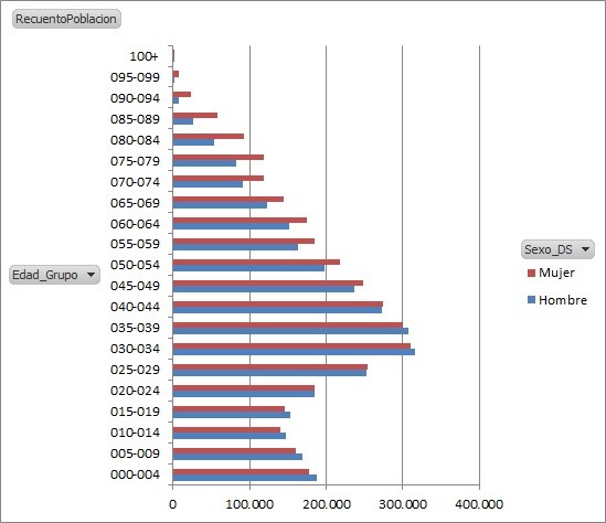
However, the main difference lies in the orientation of the men bar population, which should be left. All other aspects are basically visual configuration issues, which explain how to solve in short.
Solving the trajectory of the population bars
Focusing on the male population bar, the solution for achieve to draw itself in the opposite direction to the current, is to put in negative the values of the cells in the pivot table for this segment of the population.
If we were in a simple spreadsheet with no connection to PowerPivot, the solution is as simple as editing the cells in column Hombre, changing their values to negative, but in this scenario data is being obtained from the PowerPivot data model, so that it’s not possible directly edit the values in the PivotTable.
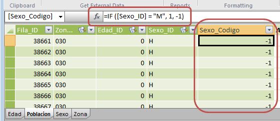
To solve this kind of problems we have to resort to the creation of columns and / or calculated measures, which through DAX expressions provide the results we need. In the transition to negative the values of the Hombre column, we will open the PowerPivot window, and placing ourselves in the first available empty column in the Poblacion table, write the following expression in the formula bar:
=
IF ( [Sexo_ID] = "M", 1, -1 )
We just created a calculated column that will be evaluated for each row of the Poblacion table, checking if Sexo_ID field value is equal to the letter «M» (Mujer), if so, the column value in that row will be 1, otherwise, when the field contains «H» (Hombre), the returned value will be -1.
Then we double-click its header to assign Sexo_Codigo as the column’s name it. We can also give name by right clicking on the header and choosing «Rename Column».
Turning again to the Excel window, we’ll remove the chart we created in the worksheet and uncheck the RecuentoPoblacion measure, leaving empty the area of the PivotTable values.
The next step will be to create a new measure named SumaPoblacion, based on the following DAX expression:
=
SUM ( [Sexo_Codigo] )
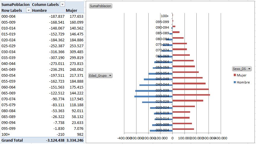
By applying this measure to the PivotTable, the SUM function takes the sum of column values passed as parameter, so the population figures of men now appear negative. This means that when re-creating the chart in the manner explained above, the indicator bars of the population values by sex are now drawn in opposite directions. As an additional feature, on «PivotTable Tools» tab, into «Design» tab, at the «Layout» group, we’ll drop «Grand Totals», selecting «On for Columns Only», that hides the row totals column, because its presence in this context is irrelevant.
Visual configuration of population bars
Although the chart bars are now shown with the effect we wanted, it would be desirable a few tweaks in its visual appearance to improve the presentation quality.
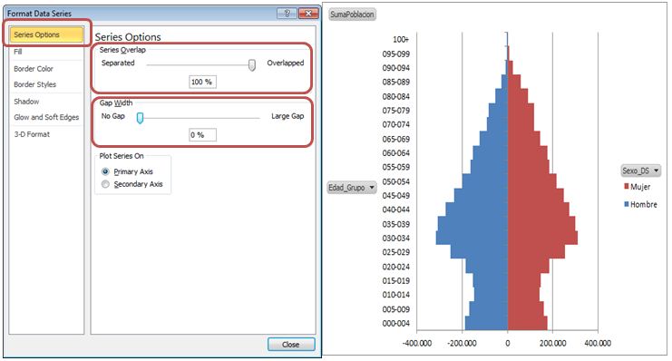
First we right click on the age ranges labels, selecting «Format axis». In the window of the same name, under «Axis Options», assign the value «Low» to «Axis Labels» property, which align the labels column to the left of the chart.

Then we right click on any of the bars in the graph, choosing «Format Data Series». In the configuration series window, into «Series Options,» on property «Series Overlap» will move the position marker to the right end position (fully overlapped), while in property «Gap Width» will move the position marker to the left end (no gap at all). In this way we will accomplish the bars increase their thickness and eliminate the space between them, being completely joined to form the population pyramid.
Calculating the population percentages
So far, the data representation obtained, both in the pivot table as in the chart pyramid is based on absolute population numbers. However, the usual practice is that such representation is made as a proportion of each age group and sex on total population.
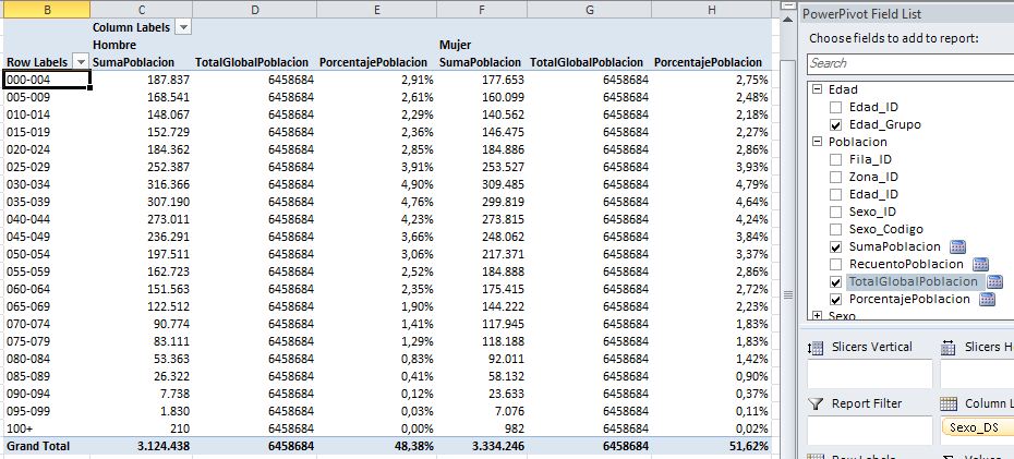
For example, in our pivot table, the women population aged between 55 and 59 is 184,888 people; to get the percentage that this population group is in relation to all individuals with whom we are working (6,458,684), we divide the group by the total, and format the result as a percentage, gaining 2.86%.
If we want the PivotTable to perform this operation for all population groups, we’ll have to add additional calculations in the form of measures, but before that we’ll remove the current population chart, because we will build it again from one of the new measures.
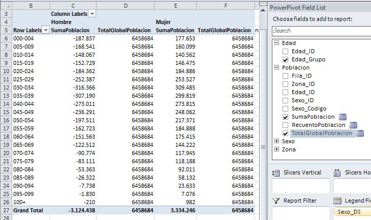
We start out the existence of a measure, SumaPoblacion, which as we know, it returns the number of people adding the field Sexo_Codigo. The next step is to create a new measure, which included in the pivot table, provide the total population in all cells.
Our first reaction might be to reuse the RecuentoPoblacion measure, created in the early stages of our example, but soon we realize that it is useless for this purpose, because although this measure counts the Poblacion table rows, the cells result are affected by the fields used in rows and columns, as well as other active filters in the PivotTable.
For a measure always count all rows in a table, regardless of the filters may be active, we’ll use the CALCULATE function, which as the first parameter pass the operation to perform, in this case the count of rows in the Poblacion table using COUNTROWS function. Then pass as many parameters as filters we want to remove, using the ALL(TableName) function for each table that is, somehow, acting as a filter.
Under such assumptions create a new measure called TotalGlobalPoblacion, with the following DAX expression:
=
CALCULATE ( COUNTROWS ( Poblacion ), ALL ( Edad ), ALL ( Sexo ) )
When applied this measure to the PivotTable, all the cells show the same value: the total population.
Now we need a third measure that makes the division between the two previous and display the result in percentage format. This new measure will have the name PorcentajePoblacion and use the following formula:
=[SumaPoblacion] / [TotalGlobalPoblacion]
As we saw in the first installment of the article, to apply the formatting to this measure will right click on one of its cells choosing «Number Format». In the format window this time select the «Custom» category, through which we introduce in the «Type» field the following format string.
0,00%;0,00%
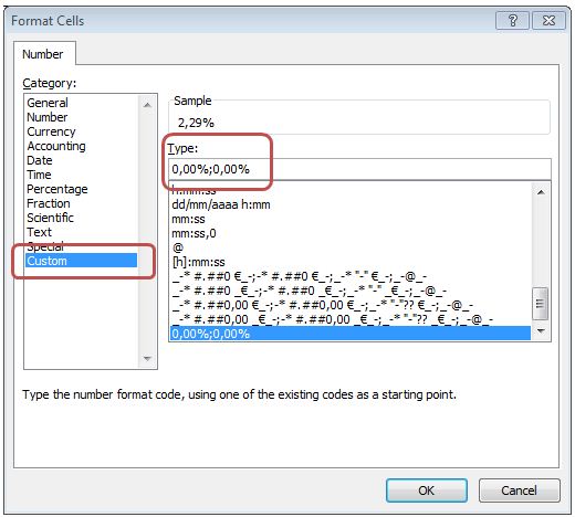
This string will format the number as a percentage, and show the male population columns values without the negative sign, but internally, these values will remain negative.
Next deactivate all PivotTable measures except PorcentajePoblación, which will be the only one that remains visible. Then again add a clustered bar chart, using the configuration steps outlined above, and adding new format features to improve their presentation.
Apply percentage format to the horizontal axis
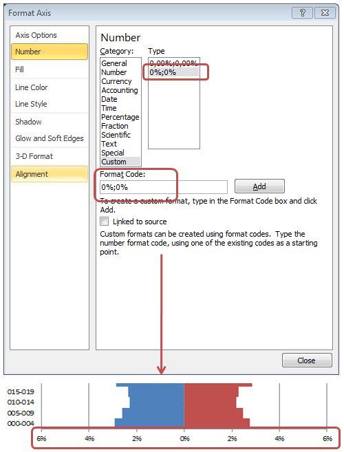
Firstly we will right click on the horizontal axis labels by selecting «Format axis», which will open the format window. In «Number» section, select the format category «Custom», and in the «Format Code» field, write the following format string:
0%;0%
By clicking the «Add» button, the string is added to the list of custom strings. Accepting the window, the format will apply to the horizontal axis labels.
Emphasizing the population bar edges
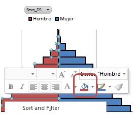
Then we will right click on one of the bars in the chart, choosing again «Format Data Series». This time, in «Border Color» section, we will click «Solid Line», selecting black color; while in «Border Styles» assign the value «2 pt.» in property «Width». This operation will make for both groups of bars in the chart.

Then we right click on the labels of the age ranges, selecting «Format axis». In this format window assign the same values for the color and border style properties that just used to the chart bars.
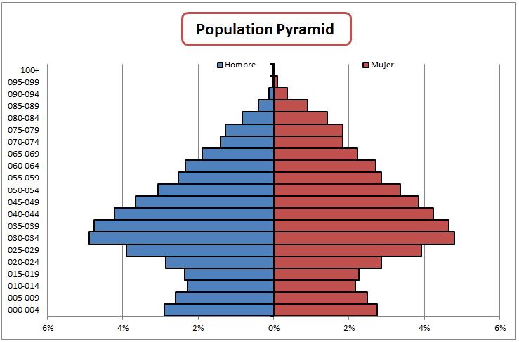
As a result of these actions, the chart will show the edges with an outline clearly highlighted.

Relocating the legend position
At the time of chart creation, Excel puts the legend (Sexo_DS field) on the right side by default. However, it is possible to change the location of this element if we want to provide more space to the drawing of population bars. To do this, we right-click the legend and select «Format Legend» in the format window, under «Legend Options», we will click «Top».
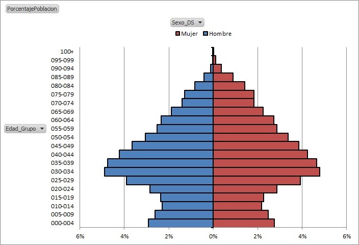
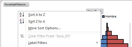
As we can see, the chart has won drawing surface, but the legend indicators have been placed in reverse order with respect to the bars. To solve this problem we will click on the legend (Sexo_DS), dropping a menu of filter options, which will select «Sort Z to A».
With this action, the legend indicators shall be placed properly, but now we will find that the colors of the bars have been reversed, and lost the edge of the chart bars.
We will restore the edges of the bars in the manner explained above, whereas in terms of colors, for each side of the pyramid do a right click on one bar and select «Shape Fill», changing the current color which originally had the chart.
To complete the adjustments we are making about the legend, drag it until it is situated at the same level of the upper element of the pyramid, and will increase its width, so that the indicators are further apart.

Clear the fields and add title
Then we right click on any of the fields of the chart buttons and select the option «Hide All Field Buttons on Chart». In this way will prevent the user to apply filters on the horizontal and / or vertical pyramid axis, keeping a solid structure thus avoiding the possibility, for example, to hide age ranges either sex. However, this filter feature will still exist from the PivotTable.
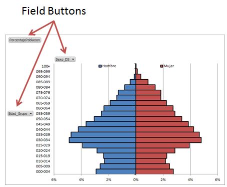
Moreover, in the tab group «PivotChart Tools» we will click on «Layout», and within the group «Labels» will click on «Chart Title», which will drop several items where we will choose «Above Chart», adding a text box to the chart, we will edit to give it a title. At this point we have completed the development of our pyramid.
Energizing the data pyramid data through slicers
Although we have achieved the stated goal of creating a population pyramid, it would be interesting to enrich the information that actually offers as we do in this section.
Looking at the data model in the PowerPivot window, we shall realize that we haven’t use health zoning information yet, so we can use these data to construct a filter that displays the pyramid based on the population concerning one or more of these health areas.
PowerPivot pivot tables, in addition to traditional filter, incorporating a new filter type called «slicer», in addition to the usual filtering functionality provides a more flexible user interface for handle the values to work with.
Let’s create one slicer on the pyramid based on zone information. To this end, on the field list panel, drag the field Zona_DS from Zona table to «Slicers Horizontal» block, resulting in a slice located above both the pivot table and pyramid chart.

To filter data by slicer simply have to select the name of the health area we want to use as a filter. It is also possible to filter several areas simultaneously holding down the Ctrl key while clicking the areas composing the filter (as shown in the figure below).To remove all active filters will click on the icon located in the upper right corner of the slicer.

And at this point we concluded the article, in which its two parts we have shown how to construct a population pyramid in Excel 2010, using PowerPivot as a management tool for population data. However, the power of this technology goes beyond the mere treatment of demographic information, covering its scope to any environment where we have to make an analysis with large volumes of data.


anonymous
This article addresses the challenge of develop a process to create a database with demographic information
anonymous
Population pyramids with PowerPivot. Chart development (and 2) – El aprendiz de brujo