Shapes en WPF

Cuando necesitamos dibujar  contenido gráfico  en dos dimensiones  (2D)  con
WPF,  la  mejor  forma  es  usando  Shapes.  Realmente  los  Shapes  son  clases
dedicadas que se utilizan para representar simples  líneas, elipses, rectángulos
y polígonos varios. Los Shapes son conocidos como primitivos porque son los
precursores de gráficos más complejos mediante la combinación de diferentes
tipos de shapes.
WPF  provee  seis  clases  que  derivan  de  la  clase  abstracta
System.Windows.Shapes.Shape:

Rectangle

De  los  Shapes  más  sencillos  con  el  que  crearemos  diferentes  tipos  de
rectángulos,  simplemente  son necesarios  establecer  las propiedades Width  y
Height.

<Rectangle Fill="Yellow" Stroke="Blue" Height="50" Width="100" Margin="5" HorizontalAlignment="Left"/> 
image 

Mediante  las propiedades RadiusX y RadiusY podemos  conseguir  rectángulos
con bordes redondeados.

image 


Ellipse

Al igual que el shape Rentangle, el shape Ellipse es utilizado para crear elipses
fácilmente. Estableciendo las propiedades Width y Height tenemos una elipse.


<Ellipse Fill="Yellow" Stroke="Blue" Height="50" Width="100" Margin="5" HorizontalAlignment="Left"/> 
image 
Line

Representa la línea que une dos puntos. Por tanto tenemos las coordenadas X
e Y de ambos puntos.

<Line Stroke="Blue" X1="120" Y1="50" X2="280" Y2="125"></Line> 

image


Polyline

Nos  permite  dibujar  una  secuencia  de  líneas  rectas  conectadas.  Para  ello
debemos  especificar  una  lista  de  coordenadas  X  e  Y  que  representan  los
puntos por los que pasará la recta.

<Polyline Stroke="Red" StrokeThickness="5" Points="10,150 30,140 50,160 70,130 190,100 210,240" /> 
image 
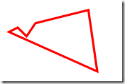
Polygon

Podríamos decir que este shape es muy parecido al anterior, al Polyline, ya que
recibe  una  lista  de  puntos  que  componen  el  polígono,  con  la  diferencia
fundamental que se unen el punto de inicio con el último punto.

<Polygon Stroke="Red" StrokeThickness="5" Points="10,150 30,140 50,160 70,130 190,100 210,240" />  

image

Path

El shape Path puede ser usado para representar formas complejas que incluyan
curvas y arcos. Para poder usar, debemos usar un tipo especial de sintaxis en
los atributos para asignar la propiedad Data.
En el siguiente ejemplo vemos algo de lo que es capaz de aportarnos el shape
Path:


<Path Fill="LightSkyBlue" Stroke="Black"> 
   <Path.Data> 
     <CombinedGeometry GeometryCombineMode="Union"> 
       <CombinedGeometry.Geometry1> 
          <EllipseGeometry Center="100,150" RadiusX="70" RadiusY="30" /> 
       </CombinedGeometry.Geometry1> 
       <CombinedGeometry.Geometry2> 
          <EllipseGeometry Center="200,150" RadiusX="70" RadiusY="30" /> 
       </CombinedGeometry.Geometry2> 
     </CombinedGeometry> 
   </Path.Data> 
</Path> 


image

Si recordais el post de Panel vemos que la  clase  Shape  deriva  de  la  clase
FrameworkElement, por lo que podemos decir que los Shapes son elementos.

Gracias a esto, tenemos las siguientes ventajas:

  • Autodibujado :El  Shape  se  autogestion  en  este  sentido  y  no  debemos  preocuparnos  por
    redibujar el shape cuando alguna propiedad del mismo cambia, ya sea tamaño,
    posición, etc.
  • Organización similar a otros elementos :Es  decir,  podemos  utilizar  los  shapes  como  elementos,  por  tanto  no  hay
    problema de incluirlos en cualquier contenedor de los descritos en anteriores
    capítulos.
  • Tienen Eventos :Disponemos de los mismos eventos que otros elementos, es decir, no debemos
    preocuparnos  en  el  trabajo  extra  que  supondría  añadir  la  posibilidad  de
    controlar eventos de ratón o similares, ya los tenemos implementados.

Custom Layouts en WPF

Hemos estado viendo en los anteriores post los diferentes layouts que viene en WPF, pero también podremos crear nuestro porpio contendor y que funcione como nosotros diseñemos. Esto es una gran flexibilidad a la hora de diseñar nuestra aplicación, para ello deberemos crear una clase que derive de Panel que explique en este post. Si recordamos los conceptos mas importantes son:

Measure

En estado de medición  (Measure) el contenedor comprueba por cada uno de
los  elementos  hijos  su  tamaño  deseado,  es  decir,  les  “pregunta”  que  tamaño
pretende ocupar en el contenedor.

Arrange

En este estado de distribución (Arrange), el contenedor coloca a cada uno de
los elementos hijos en su posición apropiada.

Ya que deberemos sobreescribir los metodos MeasureOverride y ArrangeOverride para programar como se comporta nuestro control.

Un ejemplo muy sencillo es

public class MySimplePanel : Panel
    {
        // Make the panel as big as the biggest element
        protected override Size MeasureOverride(Size availableSize)
        {
            Size maxSize = new Size();

            foreach (UIElement child in InternalChildern)
            {
                maxSize.Height = Math.Max(child.DesiredSize.Height, maxSize.Height);
                maxSize.Width = Math.Max(child.DesiredSize.Width, maxSize.Width);
            }
        }

        // Arrange the child elements to their final position
        protected override Size ArrangeOverride(Size finalSize)
        {
            foreach (UIElement child in InternalChildern)
            {
                child.Arrange(new Rect(finalSize));
            }
        }
    }

Podéis probar lo que hace.


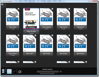
Uno mas complejo es el que he llamado AnimatedWrapPanel, se comporta como un WraPanel pero cuando pasas el raton por encima de u elemento se realiza una animación para que se vea mas grande y cuando sale el ratón vuelve a su tamaño


 /// <summary>
    /// Wrap Panel que crea una animacion cuando se construyen,
    /// los items van desde la posicion 0 hasta su lugar
    /// </summary>
    public class AnimatedWrapPanel : Panel
    {
        private TimeSpan animationLength =
            TimeSpan.FromMilliseconds(500);
        private TimeSpan animationSelected =
          TimeSpan.FromMilliseconds(200);
        private double scaleselected = 1.2;
        private Size sizecontrol = new Size();
        private bool animating = false;
        public AnimatedWrapPanel()
        {
            this.MouseEnter += new MouseEventHandler(AnimatedWrapPanel_MouseEnter);
            this.MouseLeave += new MouseEventHandler(AnimatedWrapPanel_MouseLeave);
            this.MouseMove += new MouseEventHandler(AnimatedWrapPanel_MouseMove);
        }

        void AnimatedWrapPanel_MouseMove(object sender, MouseEventArgs e)
        {
            if (!animating)
                AnimateSelected();
        }

        private void AnimateSelected()
        {
            if (this.Children == null || this.Children.Count == 0)
                return;
            animating = true;

            if (this.IsMouseOver)
            {
                double x = Mouse.GetPosition(this).X;
                foreach (FrameworkElement child in this.Children)
                {
                    if (child.IsMouseOver)
                    {

                        if (child.RenderTransform is TranslateTransform)
                        {
                            TranslateTransform trans = child.RenderTransform as TranslateTransform;
                            TransformGroup transgroup = new TransformGroup();
                            transgroup.Children.Add(trans);
                            ScaleTransform scale = new ScaleTransform();
                            scale.CenterX = trans.X;
                            scale.CenterY = trans.Y;
                            transgroup.Children.Add(scale);
                            child.RenderTransform = transgroup;
                            DoubleAnimation da = MakeAnimation(scaleselected);


                            scale.BeginAnimation(ScaleTransform.ScaleXProperty, da, HandoffBehavior.SnapshotAndReplace);

                            scale.BeginAnimation(ScaleTransform.ScaleYProperty,
                           da,
                            HandoffBehavior.SnapshotAndReplace);


                        }
                        else if (child.RenderTransform is TransformGroup)
                        {
                            TransformGroup transgroup = child.RenderTransform as TransformGroup;
                            ScaleTransform scale = transgroup.Children[1] as ScaleTransform;
                            TranslateTransform trans = transgroup.Children[0] as TranslateTransform;

                            DoubleAnimation da = MakeAnimation(scaleselected);


                            scale.BeginAnimation(ScaleTransform.ScaleXProperty,
                         da,
                            HandoffBehavior.Compose);
                            scale.BeginAnimation(ScaleTransform.ScaleYProperty,
                            da,
                            HandoffBehavior.Compose);
                        }
                    }
                    else if (child.RenderTransform is TransformGroup)
                    {
                        TransformGroup transgroup = child.RenderTransform as TransformGroup;
                        ScaleTransform scale = transgroup.Children[1] as ScaleTransform;
                        TranslateTransform trans = transgroup.Children[0] as TranslateTransform;

                        if (scale.ScaleX == 1.2)
                        {

                            scale.BeginAnimation(ScaleTransform.ScaleXProperty,
                            new DoubleAnimation(1, animationSelected),
                            HandoffBehavior.Compose);
                            scale.BeginAnimation(ScaleTransform.ScaleYProperty,
                            new DoubleAnimation(1, animationSelected),
                            HandoffBehavior.Compose);

                        }

                    }

                }
            }

            animation_Completed(null, null);
        }

        private DoubleAnimation MakeAnimation(double to)
        {
            DoubleAnimation da = new DoubleAnimation(to, animationSelected);
            da.AccelerationRatio = 0.8;
            da.DecelerationRatio = 0.2;
            return da;
        }
        void animation_Completed(object sender, EventArgs e)
        {
            animating = false;
        }
        void AnimatedWrapPanel_MouseLeave(object sender, MouseEventArgs e)
        {
            AnimateSelected();
        }

        void AnimatedWrapPanel_MouseEnter(object sender, MouseEventArgs e)
        {
            AnimateSelected();
        }
        protected override Size MeasureOverride(Size availableSize)
        {
            Size infiniteSize = new Size(double.PositiveInfinity,
                double.PositiveInfinity);
            double curX = 0, curY = 0, curLineHeight = 0;
            foreach (UIElement child in Children)
            {
                child.Measure(infiniteSize);

                if (curX + child.DesiredSize.Width > availableSize.Width)
                { //Siguiente lineaa
                    curY += curLineHeight;
                    curX = 0;
                    curLineHeight = 0;
                }

                curX += child.DesiredSize.Width;
                if (child.DesiredSize.Height > curLineHeight)
                    curLineHeight = child.DesiredSize.Height;
            }

            curY += curLineHeight;

            Size resultSize = new Size();
            resultSize.Width = double.IsPositiveInfinity(
                availableSize.Width) ? curX : availableSize.Width;
            resultSize.Height = double.IsPositiveInfinity(
                availableSize.Height) ? curY : availableSize.Height;

            return resultSize;
        }

        protected override Size ArrangeOverride(Size finalSize)
        {
            if (this.Children == null || this.Children.Count == 0)
                return finalSize;

            TranslateTransform trans = null;
            double curX = 0, curY = 0, curLineHeight = 0;
            int zindexposition = Children.Count;
            foreach (UIElement child in Children)
            {
                child.SetValue(ZIndexProperty, zindexposition);
                zindexposition -= 1;
                trans = child.RenderTransform as TranslateTransform;

                if (trans == null)
                {
                    child.RenderTransformOrigin = new Point(0, 0);
                    trans = new TranslateTransform();
                    child.RenderTransform = trans;
                }

                if (curX + child.DesiredSize.Width > finalSize.Width)
                { //Siguiente Linea
                    curY += curLineHeight;
                    curX = 0;
                    curLineHeight = 0;
                }

                child.Arrange(new Rect(0, 0, child.DesiredSize.Width,
                    child.DesiredSize.Height));

                trans.BeginAnimation(TranslateTransform.XProperty,
                    new DoubleAnimation(curX, animationLength),
                    HandoffBehavior.Compose);

                trans.BeginAnimation(TranslateTransform.YProperty,
                    new DoubleAnimation(curY, animationLength),
                    HandoffBehavior.Compose);

                curX += child.DesiredSize.Width;
                if (child.DesiredSize.Height > curLineHeight)
                    curLineHeight = child.DesiredSize.Height;
            }
            sizecontrol = finalSize;
            return finalSize;
        }
        public void Animate()
        {
            TranslateTransform trans = null;
            double curX = 0, curY = 0, curLineHeight = 0;

            foreach (UIElement child in Children)
            {
                child.RenderTransform = null;
                trans = child.RenderTransform as TranslateTransform;

                if (trans == null)
                {
                    child.RenderTransformOrigin = new Point(0, 0);
                    trans = new TranslateTransform();
                    child.RenderTransform = trans;
                }

                if (curX + child.DesiredSize.Width > sizecontrol.Width)
                { //Siguiente Linea
                    curY += curLineHeight;
                    curX = 0;
                    curLineHeight = 0;
                }

                child.Arrange(new Rect(0, 0, child.DesiredSize.Width,
                    child.DesiredSize.Height));

                trans.BeginAnimation(TranslateTransform.XProperty,
                    new DoubleAnimation(curX, animationLength),
                    HandoffBehavior.Compose);

                trans.BeginAnimation(TranslateTransform.YProperty,
                    new DoubleAnimation(curY, animationLength),
                    HandoffBehavior.Compose);

                curX += child.DesiredSize.Width;
                if (child.DesiredSize.Height > curLineHeight)
                    curLineHeight = child.DesiredSize.Height;
            }
            //this.InvalidateArrange();
        }

    }

El resultado es


image

ViewBox en WPF

Un elemento Viewbox es un contenedor que escala todos sus elementos secundarios de un modo similar a un control de zoom, solo puede tener un hijo y no una colección como teníamos en los anteriores contenedores, realmente se dice que es un contenedor de diseño.

Se encuentra en el assembly System.Windows.Controls, realmente solo escala para ajustar el contenido al tamaño, no hace un resize sino que realiza una transformación (que veremos mas adelante). Esto significa que todos los objetos tienen el mismo comportamiento que si ponemos en la propiedad  Stretch de un path o image el valor Uniform.

Yo lo utilizo para independizarme de la resolución del monitor, siempre diseño para la resolución estándar del proyecto pero meto un viewbox para que si se ejecuta en una resolución diferente sea mayor o menor  la aplicación se ajuste automáticamente, tiene muchas mas utilizadas un viewbx, debeis de experimentar con el.


<Window x:Class="WpfViewBox.Window1"
    xmlns="http://schemas.microsoft.com/winfx/2006/xaml/presentation"
    xmlns:x="http://schemas.microsoft.com/winfx/2006/xaml"
    Title="Window1" Height="300" Width="300">
    <Viewbox Stretch="Fill">
        <Canvas Height="480" Width="720" Background="Gray" Margin="10">
            <Ellipse Height="300" Width="500" Fill="Yellow" 
                     Canvas.Top="100" Canvas.Left="100" />
        </Canvas>

    </Viewbox>
</Window>

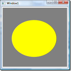
Este codigo produce como resultado:


image


Fijaros en las propiedades Height y Width y como la elipse se adapta a un tamaño menor. Si damos a maximizar la ventana


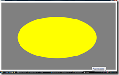
image


Vemos que la elipse se hace mas achatada en mi equipo es porque tengo una pantalla paronímica y al valor que le he puesto en stretch, jugar con los valores de strecth y veréis las importantes diferencias que hay entre un valor y otro.

Los valores que puede tener la propiedad Stretch son

  • Fill
  • None
  • Uniform
  • Uniform
  • UniformToFill

A jugar….

Discusiones de WPF 090626

Del blog de Jaime Rodiguez se han publicado emails de discusiones internas del equipo de Microsoft, aquí las tenéis, son bastante interesantes


Subject: Advise for running WPF apps over Citrix

Answer:
All versions of WPF since WPF 3.5 SP1 have remoted (both with Remote Desktop and Terminal Server) using Bitmap Remoting.
Bitmap remoting works as follows:

  • The application is rendered on the server using WPF’s software rasterizer
  • As the application runs, the server keeps track of which regions of the application’s window are newly dirty and need to be updated
  • When a region needs to be updated, the server creates a compressed bitmap of just the dirty region and sends that to the client
  • Once the client has drawn that bitmap to the appropriate place on its own window, the client window is up-to-date

Given how this remoting mechanism works, performance can be maximized in several ways:

  • Dirty regions should be kept as small as possible so the least amount of data is sent over the wire
  • Ambient animations should be turned off
    • For instance, setting a window background to an animating gradient would cause the entire window to be invalidated / redrawn every frame
  • The system does not optimize away occluded parts of the application
    • For instance, an animation that is completely hidden behind some other opaque element will still cause dirty region invalidation / bitmap generation to occur.  Remove these from your application.
  • Dirty regions should be created as infrequently as possible
    • Turn off as many animations as possible
    • For those animations that can’t be eliminated completely, lower the animation framerate using the DesiredFramerate property
  • Dirty Region Bitmaps should be as simple as possible to maximize their compression
    • Application running over TS should favor solid colors over gradients or other exotic fills (unnecessary images, etc), especially for application pieces that will be redrawn frequently
  • Avoid operations that are especially slow when rendered in software
    • BitmapEffects / Effects / ShaderEffects, especially blurs and drop shadows with large radii, are quite slow in software
    • 3D – the 3D software rasterizer is substantially slower than rendering in hardware

Subject: Is there any support in WPF for “bottom-up” bitmaps?
I’m using BitmapSource.Create with an unmanaged memory buffer. The buffer comes from a Win32 DIBSection with a +ve height, which indicates a bottom-up DIB.

Answer:
Wrap it in a TransformedBitmap. 
return new TransformedBitmap(bmp, new ScaleTransform(1,-1));

[extra tip]
Note that I think each call to CopyPixels() on the TransformedBitmap will run the scale transformation again. You can avoid this by caching the result in a CachedBitmap and using the CB instead


Subject: Getting DependencyProperty value from WinDBG
I have a dump of a WPF process and am trying to get the value of a DependencyProperty of UIElement.  Does anybody know how this can be done?

Answer:
1. Pull out the value of _packedData.
2. _packedData & 0x0000FFFF will give you the GlobalIndex.
3. Go to the DependencyObject on which you want to query the property and get access to the _effectiveValues array.
4. Go through the EffectiveValueEntry objects, looking at the _propertyIndex field until it matches the index you calculated in step 2 (the array should be sorted by property index).
5. _value is the value of the property on that DependencyObject.


Subject:  Difference between nulll and x:Null for brushes

I know there is a difference but I can’t remember. I think it had something to do with hit testing (but I can’t remember for sure).

Answer:
No difference.  You’re probably thinking of null (No hit test) versus Transparent (Can be hit).


Subject: Disable auto-word selection in FlowDocumentViewer
How can I make FlowDocumentViewer select character by character when I use the mouse?

Answer:
For FlowDocumentPageViewer, you can use flowDocumentPageViewer.SetValue(TextBoxBase.AutoWordSelectionProperty, false). FlowDocumentScrollViewer doesn’t auto-select words by default.

Internally, the selection code shared by text boxes and FlowDocument viewers relies on TextBoxBase.AutoWordSelectionProperty. We don’t currently expose the property on anything other than TextBoxBase.


Subject: Blend units.
Any reason why Blend3 outputs font size in WPF “units” and not the actual pt value. If I change the FontSize on a TextBlock to “11pt”, 14.667 is written out.
Answer:
Blend 2 always displayed text units in pixels. This was confusing to most designers who are used to thinking of fonts in terms of points. In Blend 3 we added an option where you can choose whether you want points or pixels as your display in the Property panel. This is under the Units tab in the Options dialog.

In terms of the XAML output, we had wanted to output the same units as shown in the UI but Silverlight does not support the pt syntax in XAML so we decided (for cost and consistency reasons) to just leave it as pixels in the XAML for V3.  It is something for us to consider improving in the future though.


Subject: Disable IME on TextBox
Is there a setting to disable using IME on a textbox, or some other means of not allowing a user to use it?

Answer:
<TextBox InputMethod.IsInputMethodEnabled=”false” />


Subject: DateTime property in the Properties editor of Blend
I have a question regarding how Blend handles a control property which is of type System.DateTime.  I am trying to understand how the property editor would interpret a string such as 20/05/2001. Would it take into account the regional settings of the computer or is it tied up with the implementation of the control itself?

Answer:
Blend will use a text editor to read and display DateTimes, and will parse input based on the locale settings of your machine.  In xaml, it is always stored in an invariant format(year-month-day).


Subject:  (summarized) issue w/ WPF not matching GDI on how a custom font is rendered

Answer:
There is no expectation that WPF font rasterization will match GDIGDI+ rasterization. For example if the font does not have italic or bold variants GDI will emulate bold and italic WPF will not.


Subject: DPI interop issues…

I have a drag/drop gesture that draws a drag/drop feedback in a transparent WPF window. The problem is in tracking the mouse position I had to use interop to Win32.GetCursorPos and that works, when the operating system is in 96 DPI mode.  But when you change the OS DPI to something else, like 120 or 150 DPI then this doesn’t work because positioning the transparent WPF drag/drop feedback window requires WPF device independent coordinates (essentially 96 DPI) so I need to do a conversion


Answer:
Have you looked at Visual.PointFromScreen?  It can be used to convert screen coordinates from APIs such as GetCursorPos into Device Independent Units


Subject: Game loops in WPF?
wondering how easy it would be to write a custom "game loop" within the WPF framework. By game loop, I mean pumping my own events on a custom Dispatcher so I can control the framerate of my app.

Answer:
You can write your own message pump. Just don’t call Dispatcher.Run. You need to pump messages, and you need to call ComponentDispatcher.RaiseThreadMessage as appropriate. Use reflector to see what Dispatcher.PushFrame does.

Of course, this still may not give you what you want for a "game loop"…


Subject: Is there a way to prevent exception if DataContext is null?

This is just an example.

I have a Image which is Databind to some dynamic source (image source) and it works fine and it is all done in xaml. Can we provide some defaule image source incase DataContext becomes null?

Answer:

FallbackValue is your friend: http://msdn.microsoft.com/en-us/library/system.windows.data.bindingbase.fallbackvalue.aspx


Subject: Listening to selective ETW Events

I’m writing performance tests where we want to listen to the WClientUceNotifyPresent ETW event to calculate frame rates.  However, I haven’t found provider flags to listen to it, along with a limited set of other events.

Answer:

With WPF 3.0-3.5 you unfortunately don’t have a lot of options.  You should make sure that you’re using verbosity level 4 (as opposed to 5).

If you’re on CLR 4.0 we have much more granular flags so you’ll be able to turn on a flag specifically for Graphics related events which should help .  If you have a recent drop (post Beta1) you should find our event manifest installed in windowsmicrosoft.netframeworkv4.0wpfwpf-etw.man which lists the available flags.  You will need either flag 1 `General` or flag 0x1000 `Graphics` depending on what drop you have.


Subject: Way to check if an UIElement is visible in ScrollViewer

Is there any way to check if an UI element is already showing in a scroll viewer?

Answer:
[Not right one, but works]
Use reflection to invoke ScrollViewer.IsInViewport method?

[Final]
I wouldn’t recommend this for production code.
Is there a reason you don’t want to call BringIntoView on elements that are already visible? All handlers of RequestBringIntoView I know of no-op on visible elements.

WPF Toolkit June

Se ha liberado en codeplex el WPF Toolkit, en esta versión se han corregido importantes bugs y los controles que se incluyen son:

  • DataGrid
  • DatePicker
  • Calendar
  • VisualStateManager

La novedad es que también incluye, en calidad “preview”, un nuevo control de chart –prácticamente el mismo que el de Silverlight Toolkit.


wpf_chartpreview

Mayor información (y descarga) en:

El Grid de WPF

Por  nivel de  complejidad  es  el más  complejo  pero  a  la  vez  es  el  contenedor
más  versátil. Mucho  de  lo  que  podemos  conseguir  con  el  resto  de  paneles
contenedores lo podemos crear con el Grid.
Para  realizar  un  uso  básico  del  Grid,  en  primer  lugar  debemos  definir  el
número  de  columnas  y  filas  que  tendrá.  Esto  lo  conseguiremos  añadiendo
tantos RowDefinition y ColumnDefinitions por  fila y columna que queramos
en las propiedades RowDefinitions y ColumnDefinitions.
Una  vez  difinidas  las  filas  y  columnas,  para  posicionar  cada  elemento  en  su
respectiva  celda  utilizaremos  las  Attached  Properties  del  contenedor  Row  y
Column, pudiendo aparecer más de un elemento por celda lógicamente.
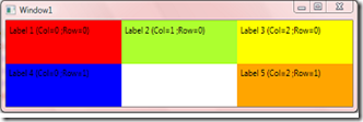
En el siguiente código XAML y su resultado podemos ver un ejemplo de Grid:

<Window x:Class="WpfApplication1.Window1" 
    xmlns="http://schemas.microsoft.com/winfx/2006/xaml/presentation" 
    xmlns:x="http://schemas.microsoft.com/winfx/2006/xaml" 
    Title="Window1"> 
    <Grid Name="mainPanel"> 
         
        <!-- Definición de 3 Columas --> 
        <Grid.ColumnDefinitions> 
            <ColumnDefinition></ColumnDefinition> 
            <ColumnDefinition></ColumnDefinition> 
            <ColumnDefinition></ColumnDefinition> 
        </Grid.ColumnDefinitions> 
         
        <!-- Definición de 2 Filas--> 
        <Grid.RowDefinitions> 
            <RowDefinition></RowDefinition> 
            <RowDefinition></RowDefinition> 
        </Grid.RowDefinitions> 
         
        <Label Content="Label 1 (Col=0 ;Row=0)" Grid.Column="0" Grid.Row="0" Background="Red" /> 
        <Label Content="Label 2 (Col=1 ;Row=0)" Grid.Column="1" Grid.Row="0" Background="GreenYellow" /> 
        <Label Content="Label 3 (Col=2 ;Row=0)" Grid.Column="2" Grid.Row="0" Background="Yellow" /> 
        <Label Content="Label 4 (Col=0 ;Row=1)" Grid.Column="0" Grid.Row="1" Background="Blue" /> 
        <Label Content="Label 5 (Col=2 ;Row=1)" Grid.Column="2" Grid.Row="1" Background="Orange" />
     </Grid> 
</Window> 
 

El resultado seria:


image


Si  queremos más  complejidad,  tenemos  la  posibilidad  de  expandir  tanto  las

columnas como  las  filas utilizando otras dos Attached Properties: RowSpan y

ColumnSpan.

Como  nota  final  podemos  destacar  la  posibilidad  que  nos  brindan  las

propiedades Height y Width de la definición de las columnas y filas. El tipo de

dato de estas propiedades no es double sino System.Windows.GridLength, por

lo que pueden tomar diferentes tipos de valores, a saber:

  • Tamaños Absolutos :Corresponde  a un  valor numérico que  representa pixeles  independientes del

    dispositivo.
  • Automático :Asignando el valor Auto,  asigna a los elementos hijos el espacio que necesitan

    única y exclusivamente, y no más.
  • Proporcional  :Asigna a cada elemento el espacio disponible dividido de forma proporcional.

Silverlight + PlayBoy bonito tratamiento de imágenes

Bondi Digital Publishing, empresa que se dedica a digitalizar revistas , ha digitalizado 53 números emblemáticos de la revista, cubriendo el tiempo entre Enero de 1954 y Mayo de 2006

El sitio y servicio Playboy Archive fue diseñado y desarrollado en Silverlight. Cada revista ha sido digitalizada completamente y cuenta con un sistema de búsqueda en vivo que permite encontrar palabras y contenidos interactivamente.


Esta muy bien (y es agradable) echarle un vistazo y ver la tecnología DeepZoom de Silverlight


Creación de un Property Grid en WPF Simple y Rapido

Me voy a saltar un poco el tutorial para enseñaros un control, tampoco es muy complejo creo que se puede seguir perfectamente

En una de mis recientes aplicaciones he utilizado el control Property Grid de Denis Vuyka ya que tuve que realizar un diseñador de formularios en WPF, pero ese sera un tema para mas adelante.

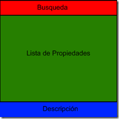
Me he planteado realizar uno, no tan profesional como el de Denis, aquí tenéis el planteamiento, la idea es dividir el control en tres partes

image

La búsqueda realizara un filtrado de las propiedades, luego tendremos un StackPanel que contendra el nombre de la propiedad y el valor y por ultimo la descripción de la propiedad seleccionada.

En el control tendremos una propiedad SelectedObject de tipo Object a la cual le pasaremos la instancia del objeto del cual queremos mostrar sus propiedades, una vez pasado un objeto a esta propiedad rellenaremos la lista de propiedades que sera un StackPanel a la que iremos añadiendo items por cada propiedad del objeto

Aquí tenéis el código para sacar la lsita de propiedades


                this.PropertyPanel.Children.Clear(); //Limpiar la lista de propiedades 
                
                foreach (PropertyDescriptor property in TypeDescriptor.GetProperties(value))
                {
                    if (!property.IsBrowsable) continue; 
                    PropertyItem currentProperty = new PropertyItem();
                    currentProperty.PropertyName = property.Name;        
                    Binding b = new Binding(property.Name);
                    b.Source = selectedObject;
                    b.Mode = property.IsReadOnly ? BindingMode.OneWay : BindingMode.TwoWay;
                   
                    currentProperty.SetBinding(PropertyItem.PropertyValueProperty, b);
                    currentProperty.OnActive += new EventHandler<DescriptionEventArgs>(currentProperty_OnActive);
                    
                    foreach (Attribute attribute in property.Attributes)
                    {
                        if (attribute.GetType() == typeof(DescriptionAttribute))
                        {
                            currentProperty.PropertyDescription = ((DescriptionAttribute)attribute).Description;
                        }
                       if (attribute.GetType() == typeof(CategoryAttribute)) {
                            currentProperty.PropertyCategory = ((CategoryAttribute)attribute).Category;
                        }
                    }      
                    PropertyPanel.Children.Add(currentProperty); 
                }

El Xaml del control es tan sencillo como el que sigue


<HeaderedContentControl x:Class="PropertyGridDemo.PropertyGrid"
    xmlns="http://schemas.microsoft.com/winfx/2006/xaml/presentation"
    xmlns:x="http://schemas.microsoft.com/winfx/2006/xaml"
    xmlns:pg="clr-namespace:PropertyGridDemo" Height="146" Width="189">
    <HeaderedContentControl.Resources>
        <ResourceDictionary Source="Themes/Generic.xaml"/>
    </HeaderedContentControl.Resources>
    <HeaderedContentControl.Header>
        <Grid>
            <Grid.ColumnDefinitions>
                <ColumnDefinition Width="50"/>
                <ColumnDefinition Width="*"/>
            </Grid.ColumnDefinitions>
            <TextBlock Text="Buscar:" Grid.Column="0" VerticalAlignment="Center" HorizontalAlignment="Center"/>
            <TextBox x:Name="searchTextBox" Grid.Column="1"/>
        </Grid>
    </HeaderedContentControl.Header>
    <Grid>
        <Grid.RowDefinitions>
            <RowDefinition/>
            <RowDefinition Height="50"/>
        </Grid.RowDefinitions>
        <ScrollViewer x:Name="propertyGridScrollBar" Grid.Row="0" CanContentScroll="False" VerticalScrollBarVisibility="Visible">
            <ScrollViewer.Content>
                <StackPanel x:Name="PropertyPanel"/> 
        </ScrollViewer.Content>
        </ScrollViewer>
        <TextBlock x:Name="descriptionTextBlock" Grid.Row="1" TextWrapping="Wrap"/>
    </Grid>
</HeaderedContentControl>

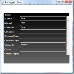
El resultado es el siguiente pasándole a la propiedad la instancia de un Button

image 

Os dejo a vosotros terminarlo y dejarlo bonito bonito


Espero que os hay gustado