Translating Designs into Layouts: Units Conversion

One aspect that Apple pushed to the limits is the union between Designers and Developers. Instead of understanding the product development process as a chain, it is done as a very close relationship walking in the same direction. Both of them speak different languages: they use different tools during their day-to-day job, they see different aspects of the product, their definition of done is different, etc.
But there is something in common, which turns out to be a quite important thing: both want the product to succeed. Both want to deliver the best shape of what they are working on, and want to exceed the customer’s expectations. Thus, it is worth looking for ways to improve this beautiful marriage.
Within the following paragraphs, we will cover how to translate design sizes into numbers which can be written directly into the UI designers (Xamarin’s one for Android and iOS, and Microsoft’s one for Windows Phone). Even for Xamarin.Forms’ XAML. Building UI layouts takes a large amount of time of the development process, and we have found quite helpful at Plain Concepts to accelerate this task.
Suppose the following scenario: we have started a new mobile project, and there are ready the first pages from the Design Team. We pick one of those (maybe in PNG, or PSD, formats), and create our view on Visual Studio.
It is very frequent that we choose a ruler tool on our favourite image editor (I personally use Gimp, have learnt the basic commands to do these taks comfortably), and it results on 100 px. How do we translate such for every platform? Each one of these, expresses the sizes in different units:
Android
- By-default unit: dp (density-independent pixel)
The density-independent pixel is equivalent to one physical pixel on a 160 dpi screen, which is the baseline density assumed by the system for a “medium” density screen. […] The conversion of dp units to screen pixels is simple: px = dp * (dpi / 160). […] You should always use dp units when defining your application’s UI, to ensure proper display of your UI on screens with different densities. Source
- Formula: dp = px / (dpi / 160), where px is given by the ruler, and dpi depends on the device we want to target
- For example, 100 px on a Nexus 5: dp = 100 / (445 / 160) = 36
- Gather a device DPI: http://dpi.lv/
- For example, Nexus 5: http://dpi.lv/#1920×1080@4.95″
iOS
- By-default unit: pt (point)
- 1 pt is translated into 1 px on an iPhone 3*: 320×480 in 3,5’’
- On the 4/4S, the screen resolution was increased to 640×960, so 1 pt is equivalent 2 px on those (@2x)
- With 5/5C/5S, theirs height grew up to 640×1136, but we keep with 1 pt = 2 px
- And with the new 6/6 Plus
- 6: screen res. of 750×1334, with 1 pt = 2 px
- 6 Plus: screen res. of 1080×1920 (downsampling!), with 1 pt = 3 px (@3x)
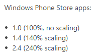
Windows Phone
- By-default unit: px (1 px in XAML is 1 px on the device at 100%) http://msdn.microsoft.com/en-us/library/windows/apps/windows.ui.xaml.frameworkelement.width.aspx
http://msdn.microsoft.com/en-us/library/windows/apps/hh465362.aspx
Xamarin.Forms (our beloved)
When there is a size expressed on both XAML and C# Xamarin.Forms’ layouts, it is automatically passed to the final platform without conversion. Then, the behavior is exactly the same as the three from above.
It is important to note, and is quite used on projects, to express different sizes depending on the device. For such, Xamarin.Forms provides the Device.OnPlatform static method. Here is an example on XAML (extracted from http://developer.xamarin.com/guides/cross-platform/xamarin-forms/xaml-for-xamarin-forms/essential_xaml_syntax/):
[code language=”xml”]
[/code]
We have seen how each device understands the size units. Also, how Xamarin.Forms handles such values, leveraging the underlaying behavior.
There are some other aspects from the De[sign|velop]er workflow we have discussed at Plain Concepts how to improve: assets trimming, splash screens, typefaces, etc. We would really like to know your thoughts on this matter, and how it is handled on other teams and companies.
Pingback: Translating Designs into Layouts: Units Conversion | form().follows().function()
Pingback: Adam J Wolf: Weekly Xamarin Newsletter Issue #35 | XamGeek.com
Pingback: Marcos Cobeña Morián: Translating Designs into Layouts: Units Conversion | XamGeek.com